Wednesday, 15 December 2010
Tuesday, 2 November 2010
 target audience when looking at the picture you would think it would from 12-30 yrs you would think that because its not to scary but still when you look at it it gives a chill through you
layout:the layout of this cover is the headline(storys) on the left side then some lttle thing on the right side, the masthead is on fire in he backround and is like that to match with the film name Hell Boy2 as in hell as in fire
image:once as like the other cover the actor/character is in the centre, also the character is looking straight at us to show us whats going ona and what my happen e.g facial expression
its close up of the person and his body language is not so much open but mostly closed which can show character
copy(text): is bold and as if it was burnt to get that shape, it was in red to represent fire
it also looks like its been ingraved
 the target audeienc for this movie is 18-40 yrs because of the knife in his hand towards you and he has a massive scar on his neck and eyes are directly looking at us which direct address
layout:the actor is right in the middle so that your attention goes straight to him and what he is holding which is a knife, then u have the masthead and its behind the actor to say hes more important,
font/color: the font of the writing is bold and looks like it been stamped in red
copy(text): it uses words which attract you in such as "only,exclusive ....
image:as i said before the expressions on his face body language is not closed and not to open but it makes u want to read it
Wednesday, 20 October 2010
i chose the spirt pic beacuse i like the close up of his face and his expression
i chose the green lantern because i like how a part of the face is in a the middle opening
i chose the megan fox photo because i like the shot type and how it suits it
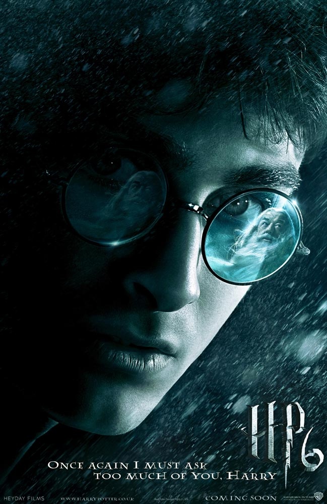
i chose the harry potter photo beacause of the expresstion and the pose and the shot type and what uou see in the eyes how angry
i chose the robin hood picture because of the shot type , the actual pic, the expresstion
i chose this because of the backround picture , the shot type, the typegraphy and yet again expresstion
and finally i chose the ugly truth picture because i wanted this type of picture for my magazine cover like a simple but full of meaning
i chose the green lantern because i like how a part of the face is in a the middle opening
i chose the megan fox photo because i like the shot type and how it suits it
i chose the harry potter photo beacause of the expresstion and the pose and the shot type and what uou see in the eyes how angry
i chose the robin hood picture because of the shot type , the actual pic, the expresstion
i chose this because of the backround picture , the shot type, the typegraphy and yet again expresstion
and finally i chose the ugly truth picture because i wanted this type of picture for my magazine cover like a simple but full of meaning
Sunday, 17 October 2010


Tuesday, 12 October 2010
Wednesday, 29 September 2010
Monday, 20 September 2010
Monday, 13 September 2010
Subscribe to:
Comments (Atom)